Behind the Palette: How I Use Color to Create Emotion in AI Art
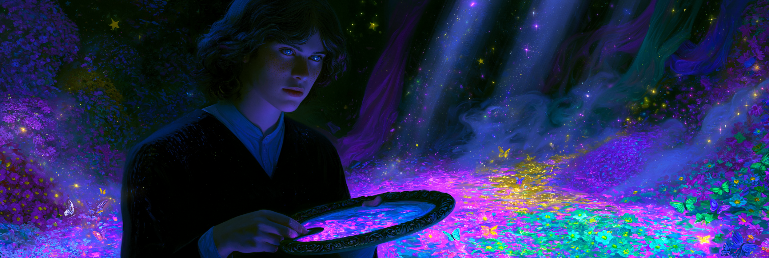
When I create AI art, I am not only thinking about the subject. I am also thinking about how I want the image to feel.
Before a viewer notices the clothing, background, lighting, or small details, color has already created a mood. It can make an image feel dreamy, romantic, mysterious, powerful, peaceful, or dramatic.
That is why color plays such an important role in my creative process.
I Start With a Feeling
Before choosing a color palette, I usually think about the emotion behind the artwork.
Do I want it to feel soft and magical? Dark and cinematic? Bright and playful? Warm and comforting?
Once I know the feeling, the colors become easier to choose.
Soft pinks, lavender, pale blue, and cream can create a gentle or romantic atmosphere. Deep red, black, emerald green, and gold can make an image feel rich and dramatic. Neon colors can add energy and give the artwork a futuristic look.
I try to make sure the palette supports the idea instead of competing with it.
Keeping the Palette Focused
AI-generated artwork can sometimes become visually busy. There may be too many colors, textures, background details, and decorative elements all fighting for attention.
To avoid that, I often work with a smaller color palette.
I may choose one main color, one supporting color, and one accent. For example, I might use dark blue throughout the scene, silver for the clothing and lighting, and soft pink for a few glowing details.
A Simple Palette Formula: When building a prompt, I often begin with a 60–30–10 approach: one dominant color shapes most of the scene, a secondary color adds contrast, and a smaller accent color draws attention to the most important detail. This gives the image variety without making the palette feel scattered.
This helps the artwork feel more polished and intentional.
A limited palette does not have to be boring. Different shades, lighting, shadows, and textures can still add plenty of depth.
Using Color to Draw Attention
-
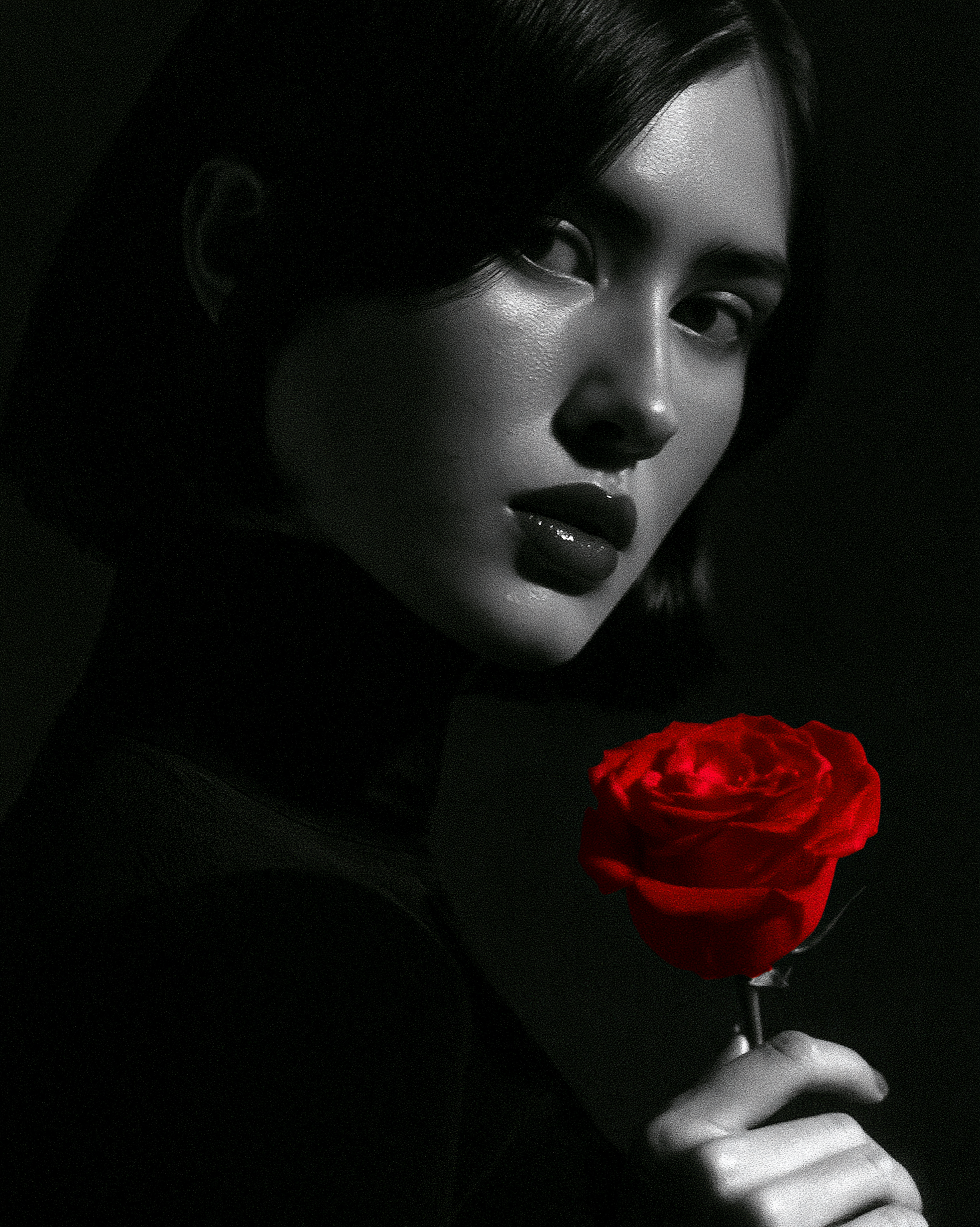
A dramatic black-and-white portrait of an elegant woman holding a single vivid red rose, monochromatic clothing and background, high-contrast studio lighting, smooth shadows, subtle film texture, the red rose as the only color in the image, intense eye contact, sophisticated editorial composition, realistic illustration, emotional and cinematic.
Color is also useful for guiding the viewer toward the main subject.
A bright figure against a dark background will naturally stand out. A golden light surrounded by cool blue tones will immediately attract attention. Even one small red detail can become powerful when the rest of the image is neutral.
This is especially helpful in detailed fantasy scenes, where the character can sometimes get lost in the background.
I want the viewer to know where to look first.
Soft Pastels
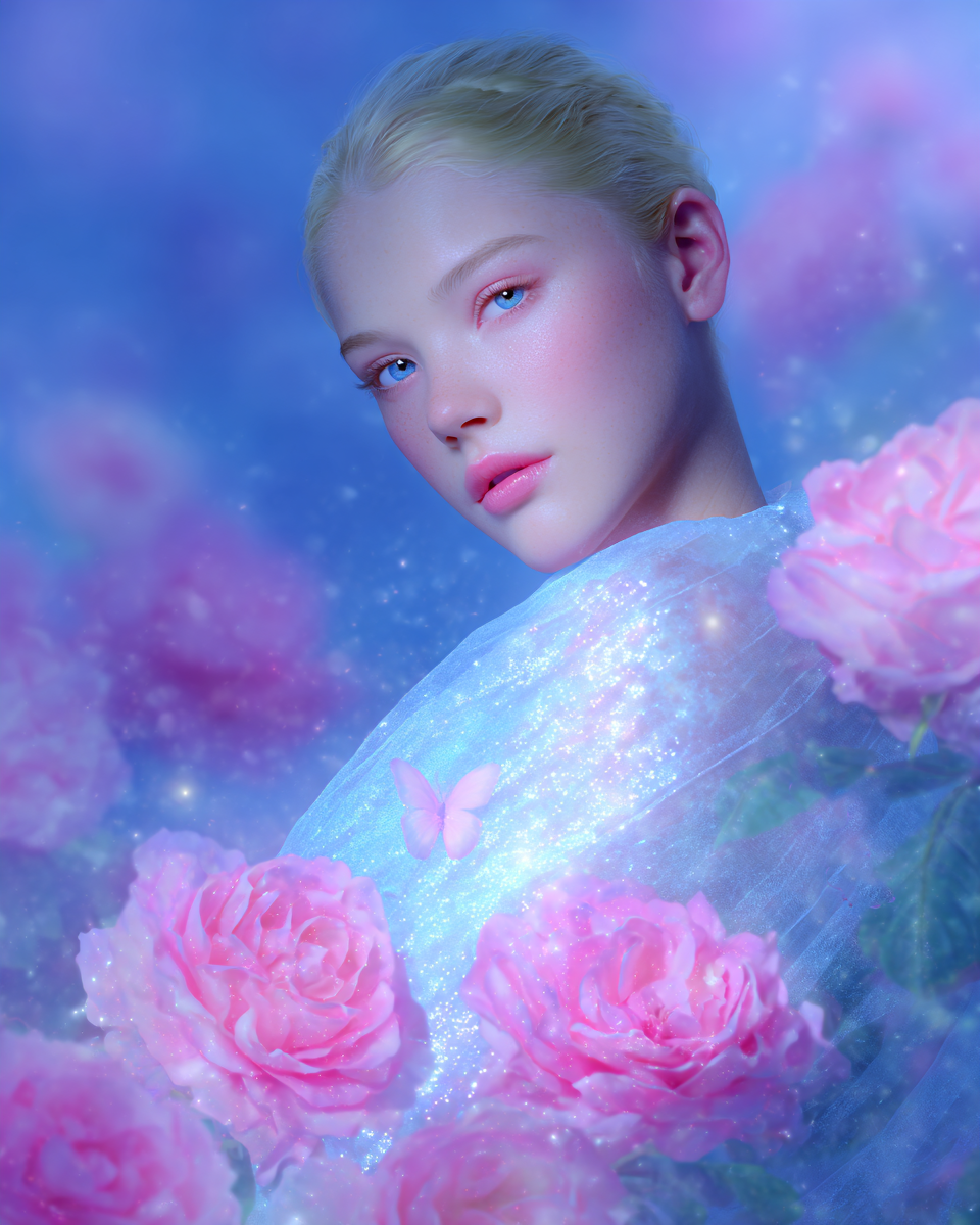
Pastel colors are some of my favorites for creating dreamy and magical artwork.
Soft pink, peach, lavender, mint, and pale blue work beautifully with flowers, sparkles, glowing clouds, angels, fantasy portraits, and gentle animal scenes.
Pastels can make an image feel peaceful, delicate, and almost weightless.
They can also create an interesting contrast when used with a stronger subject. A warrior surrounded by pale flowers and soft lavender mist can feel graceful instead of aggressive.
Rich Jewel Tones
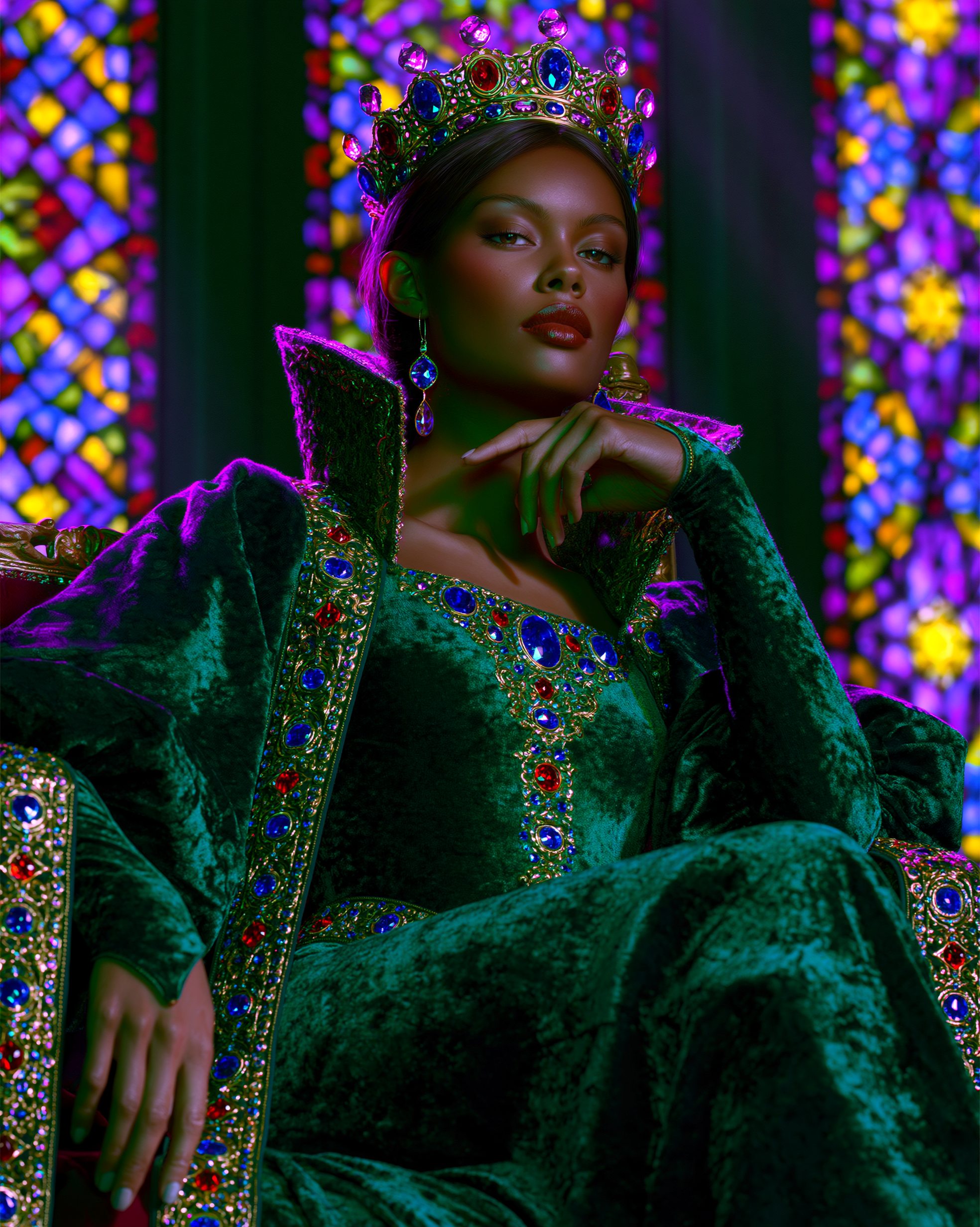
When I want an image to feel elegant or luxurious, I often think about jewel tones.
Emerald green, sapphire blue, ruby red, amethyst purple, and gold can make a portrait feel regal and cinematic.
These colors work especially well with fantasy royalty, dramatic fashion, Gothic settings, velvet fabrics, gemstones, metallic details, and stained glass.
Jewel tones can make even a simple portrait feel like it belongs to a much larger story.
Dark and Mysterious Palettes
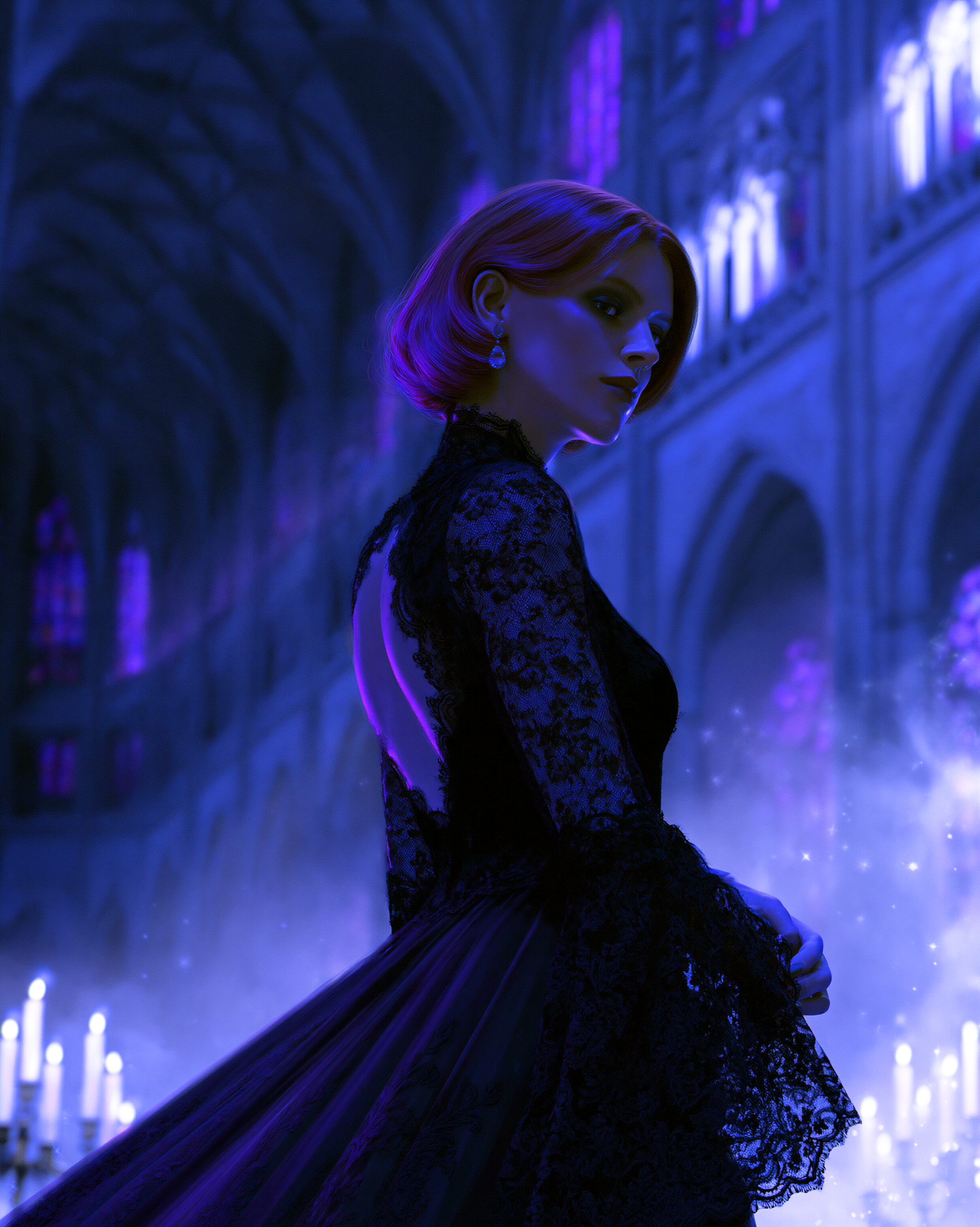
Dark colors can create some of the strongest moods.
Black, burgundy, midnight blue, deep purple, and forest green can make an image feel mysterious, emotional, or powerful.
I enjoy using darker palettes for Gothic artwork, moonlit scenes, dramatic portraits, stormy skies, and shadowed forests.
The important thing is adding enough light so the details do not disappear. A glowing face, silver moonlight, candlelight, or a bright accent can bring the entire image to life.
Warm and Cool Colors
Warm colors such as red, orange, peach, yellow, and gold can make an image feel energetic, romantic, or comforting.
They work well with sunsets, autumn scenes, celebrations, and nostalgic settings.
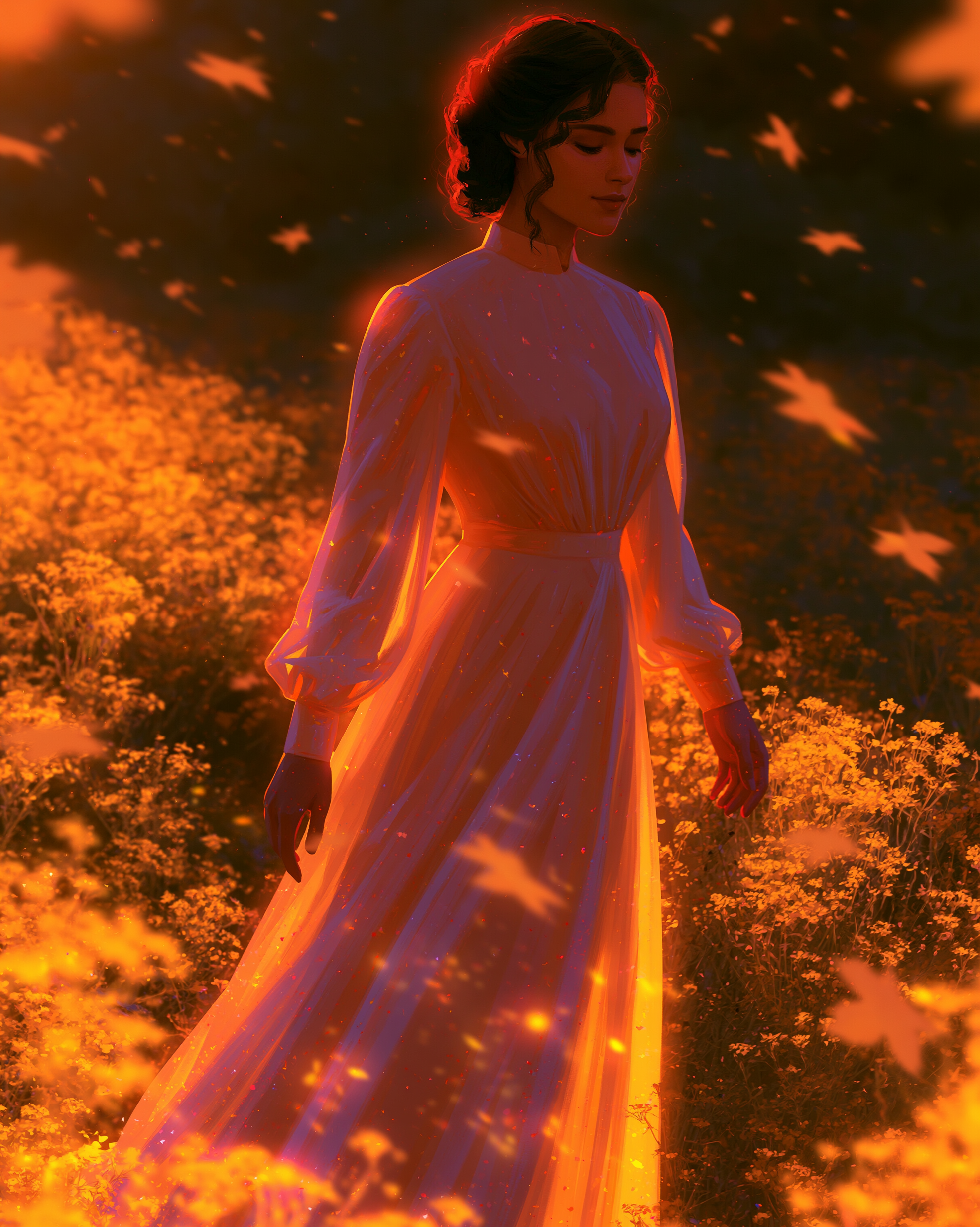
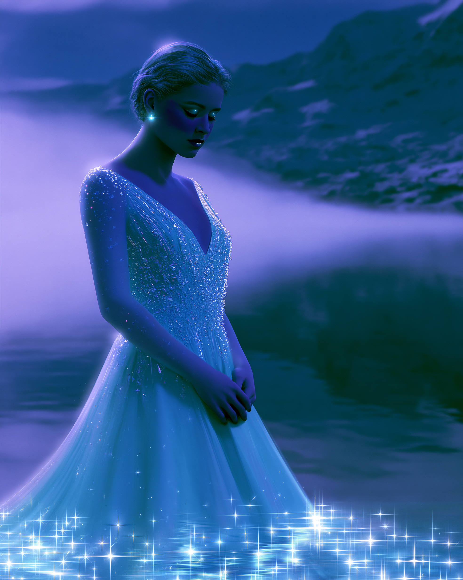
Cool colors such as blue, teal, silver, and icy white can create calmness, mystery, or distance. I often use them for ocean scenes, winter artwork, celestial themes, and quiet portraits.
The exact shade can completely change the meaning. A soft sky blue may feel peaceful, while a deep midnight blue may feel lonely or mysterious.
Creating a Cohesive Collection
Color is also one of the easiest ways to connect several pieces of art.
The subjects may be different, but repeating the same palette can make everything feel like part of one collection.
A series might use the same pink glow, the same black-and-red combination, or the same blue-and-gold lighting in every image.
This is helpful when I am creating artwork for a gallery, social media series, wallpaper collection, or themed section of my website.
Consistency makes the collection feel more intentional.


Prompt’s
-
A graceful woman surrounded by oversized roses and delicate vines, wearing a blue-and-gold couture gown, soft golden lighting, sapphire shadows, subtle sparkles, elegant fantasy portrait, highly detailed realistic illustration, cohesive luxurious palette, semi-macro composition.
-
A majestic white peacock standing among blue flowers and golden leaves, sapphire feathers with subtle metallic highlights, glowing golden light, floating sparkles, elegant fantasy garden, rich blue-and-gold palette, highly detailed realistic illustration, cinematic composition.
-
A grand fantasy palace at twilight, sapphire-blue domes, golden windows, ornate bridges, reflective water, glowing lanterns, deep blue sky, subtle stars and sparkles, elegant cinematic atmosphere, consistent blue-and-gold color palette, highly detailed realistic illustration.
Exploring One Idea in Different Colors
One of my favorite things to do is create several versions of the same concept using different palettes.
A floral portrait could be soft and romantic in pastel pink, dramatic in black and red, elegant in emerald and gold, or peaceful in blue and silver.
The subject may stay almost the same, but the feeling can change completely.
Sometimes an unexpected color combination becomes the strongest version.
That is part of what makes experimenting with AI art so exciting.


Prompt’s
-
An elegant woman standing beneath an archway covered in flowers, flowing couture gown, soft pink, lavender, cream, and powder blue palette, glowing clouds, delicate sparkles, dreamy lighting, peaceful expression, romantic fantasy atmosphere, highly detailed realistic illustration, centered composition.
-
An elegant woman standing beneath a floral archway, flowing emerald-green couture gown with gold embroidery, dark green foliage, glowing golden flowers, warm dramatic lighting, luxurious regal atmosphere, highly detailed realistic illustration, centered composition.
-
An elegant woman standing beneath a floral archway, flowing black couture gown with deep red accents, crimson roses, dark mist, dramatic moonlight, subtle red sparkles, mysterious Gothic atmosphere, highly detailed realistic illustration, centered composition.
-
An elegant woman standing beneath a floral archway, flowing sapphire-blue and silver couture gown, pale blue flowers, crystal leaves, moonlit mist, cool glowing light, silver sparkles, calm celestial atmosphere, highly detailed realistic illustration, centered composition.
Color Is Part of the Story
Color is never just a finishing touch for me.
It helps create the atmosphere, guide the viewer, highlight the subject, and bring emotion into the artwork.
When I create an image, I am not only asking what it should look like.
I am asking what it should make someone feel.
Very often, that feeling begins with color.
Ready to create artwork with a color palette that tells its own story? Explore my portfolio for inspiration, or commission a custom concept designed around the mood, colors, and emotions you want to bring to life.